

Though this year has started not in the best way, it brought many exciting UI/UX design trends. Some of them might already be familiar and some are completely new. Nevertheless, each of them deserves your attention and close consideration. Let’s start!
Audio UX Design
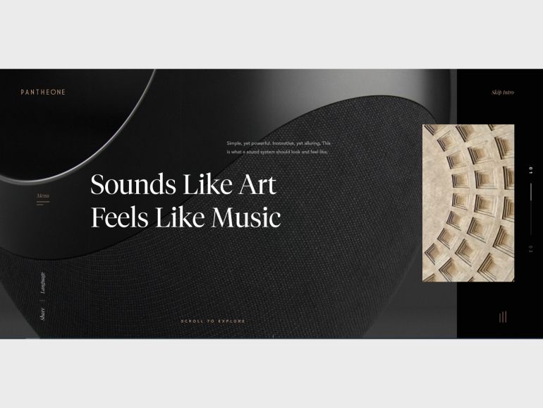
Enhancing user experience and interface interactions through sound became quite trendy this year. Music can sometimes be a real game-changer and create an enjoyable journey for users. If to appropriately implement this technique, it becomes a worthy addition to a website’s visual representation and even emphasizes the most important parts of the design.
It is essential to mention, however, that Audio UX Design is quite a controversial trend since most people often have a negative attitude towards auto-play music on a website. In most cases, you casually browse through web pages and do not expect to hear any sound unless you turned it on purpose. Any random sound might be distracting and even annoying if the user was not ready for it. That is why this new UI design method should be used mindfully.
Nevertheless, Audio UX Design is indisputably popular and can even serve a noble purpose. The design based on music implementation is quite effective to satisfy the needs of users with visual impairment. Sound effects can facilitate the navigation process and thus make the technology available for more user categories.
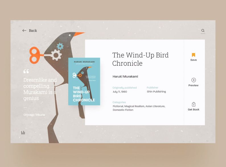
Use of Empty Space
Sometimes even a good UI design can look like a mess of different elements that are equally highlighted and crave attention. In this case, your CTA or important message can easily be lost in all of the design redundancies. What you can do to overcome this problem is to leave more empty space, which already became quite a popular method in 2020.
This design trend implies that if you have an important element and you want it to be noticed by users, then give it some space. It would be better to say “give it a lot of space.” You can provide it with any type of empty space, including passive or active space, macro or micro, and text or paragraph one.
All you need to do is to ensure that the highlighted element really worth users’ attention. Otherwise, beware of a backfire in terms of dissatisfaction and decrease of interest.
Color-Changing Gradients
I know what you think, gradients were a thing long ago and have already reached the top point and vanished. However, 2020 seems to start bringing some of the past UI design trends back, and now you can see gradients almost anywhere. It often goes even beyond UI/UX design, and you might have noticed a few shops or supermarkets styled with a gradient approach, as well as clothes and electronic devices.
What is interesting here is that it is not only a mere comeback of gradients, but it is also the metamorphosis of the style. Unlike the past monotone gradients, its modern manifestation combines multiple colors and has minimum contrast. Therefore, something new is actually well-forgotten old viewed from a different angle.
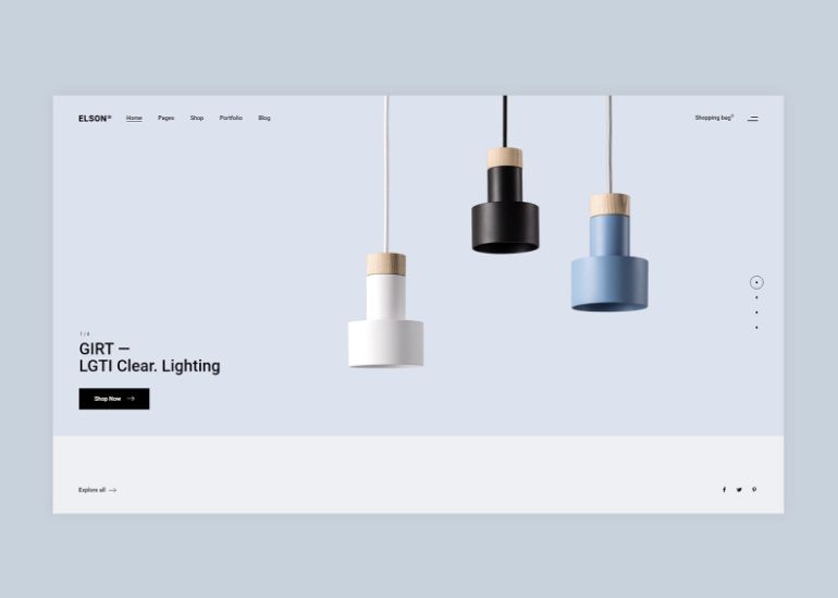
Continuous User Experience
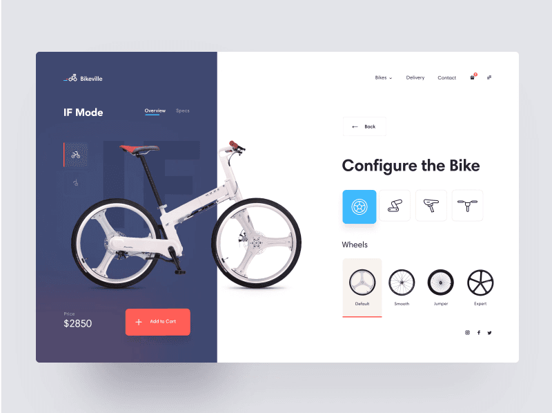
by Den Klenkov
Probably the worst thing that is inherent to 99% of interfaces and that have a fairly negative effect on user experience is various interruptions. Want to see that picture? Then, if you'd be kind enough, go to the other page and let the image load in a popped out window. Want to review the characteristics of a desirable product?
Then click the characteristics section and wait till it loads. The list is long and numerous other things interrupt users on their way to a desirable goal. In this manner, the very purpose of a continuous UX trend is to eliminate any hitch when using technology and become the best style of all modern UI designs in the process.
To better understand how it works, let’s imagine how a user (Jeff) is buying a product online. Jeff is looking for a new bicycle. He knows quite a lot about bikes, and after he chooses the first one that he likes, Jeff immediately clicks the Characteristics section to see its weight, speed regimes, and manufacturer. He sees how the characteristics instantly appear on the right side of the screen. No other tabs, no popping windows needed. He clicks on the Reviews section, and user reviews appear on the place of the characteristics. Then, Jeff wants to customize the bike a little bit and change its color and alternatives of wheels or a handlebar. But again, there are no other tabs and no popping windows — the changes occur immediately on the same page, a specific fragment of the picture changes. Therefore, Jeff is always focused on the bike he likes.
As you see, there are no chances that Jeff would bounce off, and that’s what I call an effective design. Though a continuous user experience might be hard to implement, it is worth all the efforts.
Asymmetrical Split Screen
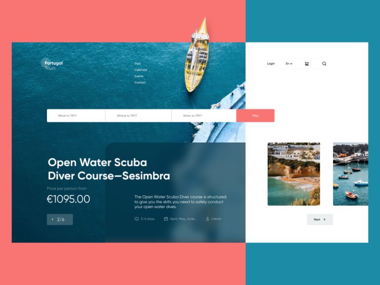
by tubik
Undoubtedly, the symmetrical block structure of a web page pleases the eye of a perceiver and promotes the digestion of the textual information. Everything is fine about it, but you know what? That is just boring. Fortunately enough, modern UI design trends show that there is an irresistible desire for asymmetry deep down in our hearts.
Asymmetrical split screen is the manifestation of that desire that becomes more and more popular this year. Combining both pictorial and textual forms in a chaotic yet appealing parallel, this style allows for creating real UI design masterpieces. In the right hands, an asymmetrical split-screen design technique can turn a web page into a work of art.
The samples of this style look especially great on modern wide screens that allow grasping the whole complexity of the page structure.
Neumorphism
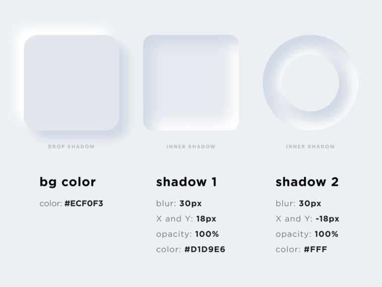
by OTAKOYI
Skeuomorphism appeared quite a while ago and did not achieved a great extend of popularity. This style implies that some of the interface objects imitate/mimic their real-world counterparts in how they look or how a user can interact with them. Nevertheless, Skeuomorphism underwent a transformation in late 2019 and is ready to change the UI design once and for all this year.
Neumorphism (or New Skeuomorphism) was developed by Jason Kelley and Alexander Plyuto, and it follows the same approach as its predecessor but in a more minimalistic style. Using light and shadows, Neumorphism allows turning a CTA button into a 3D-like element, and when you click it, the CTA will be pressed like a regular real-world button. This effect makes the interface quite appealing and clickable.
Our designers even created a small guide to Neumorphism style, and it was on top charts for almost a week on Dribbble.
Dark Mode Design
You have probably noticed how more and more apps offer to switch to a dark mode, and there is a good reason for that. Users really like that possibility and its elegant style. Some people even opt for a dark mode because it makes it easier for them to read long texts. In this manner, that growing demand has led to the creation of a whole new design approach which is already used by many websites — “Dark Mode” design.
Dark design style makes everything look extremely stylish and serious, showing that it is not for joy but for business. Besides, the color palette of this style makes it extremely easy to highlight the most important elements of the interface by only using lighter colors. There is no chance that a yellow CTA “Contact Us” button will get lost on a black background if you know what I mean.
Overlapping Layers
by Dwinawan
Designers of 2020 just can’t get enough of those layers and even put them one on another. Luckily though, this overlapping creates quite a cool 3D-like effect and allows a perceiver to feel like the web page has various dimensions and depth. No wonder that overlapping became one of the latest UI trends.
Overlapping can occur not only on two layers but on three, four, and more if the overall picture retains visual aesthetics. Besides, you can overlap various elements of the interface, including background and content boxes, video frameworks and pictures, and text and items of the interface.
An overlapping layer approach can be applied as an addition to almost any other design style. However, when doing so, be sure that the flow of user attention works well for you.
Advanced Animation
by Daniel Tan
Dynamic and powerful animations became an inherent part of modern UX design, and this year keeps this trend. You might have noticed how almost any website today shifts from static visual representations to motion. Animations are everywhere starting from a short animated video at the top of the home page and to some light and simple animations of a menu dropdown or various clicking effects.
Indeed, sometimes an eye-catching short animation can be more persuasive than a few pages of text, and companies try to use this advantage. For instance, a whole website can be built on one advanced animation that continues when a user scrolls. Usually, these sites require good hardware and an internet connection to work well, but the impression they do on a user is terrific. In most cases, it will look like those who did it are professionals (which is true) and that it might have cost them a pretty penny (which is also true).
Conclusion
Those were some of the most notable design trends so far. As you might have noticed, some of the mentioned UI trends are alterations of the past ones that acquired a brand new appearance in 2020. It is quite a normal phenomenon and there is nothing bad about it. Each time a particular style becomes trendy one more time, it becomes better, more thought out, and more suited to modern realities and user demands.
If you need UI/UX design assistance, OTAKOYI is at your service. Our designers know all of the latest UI technologies and UX/UI best practices, and they know how to efficiently use them in your favor. Contact our team right away and let’s discuss what design style suits your next project!


