

We see notifications on the Internet and mobile devices every day. Initially, they were supposed to make for good user experience and usability in general. But as a matter of fact, if notifications are poorly designed, they soon become annoying.
They are everywhere - from the desktop notes to messages that a user can turn on and off in mobile apps. Since they have become widely spread, their design is taken as given, which usually results in unsatisfactory UX.
So what makes a good design? When and where is a message supposed to pop up?
Subtlety
There’s a fine line between messages that help users with timely warnings and reminders, and messages that get in the way of app users. To stay on the users’ side, designers must understand where this line lies.
Messages always have to be subtle to the full. They shouldn’t disturb the users, but at the same time, they must fulfill their function and remind the users that something important is about to happen.
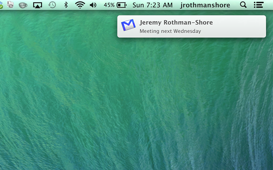
Here’s a simple example of a Mac OS email. The operational system decides on its own how to inform a user about a new letter. If the user doesn’t open it for some time, the system looks for a way how to attract the user’s attention without destroying usability.
When a user receives a new letter, a small notification pops up in the upper right corner. Despite the size, it’s visible because movement always catches the eye, and its modest size does not bother the users while they are doing what they have to do. To cut a long story short, these friendly messages are awesome because they achieve their purpose and do not clutter UX.
Relevance based on location
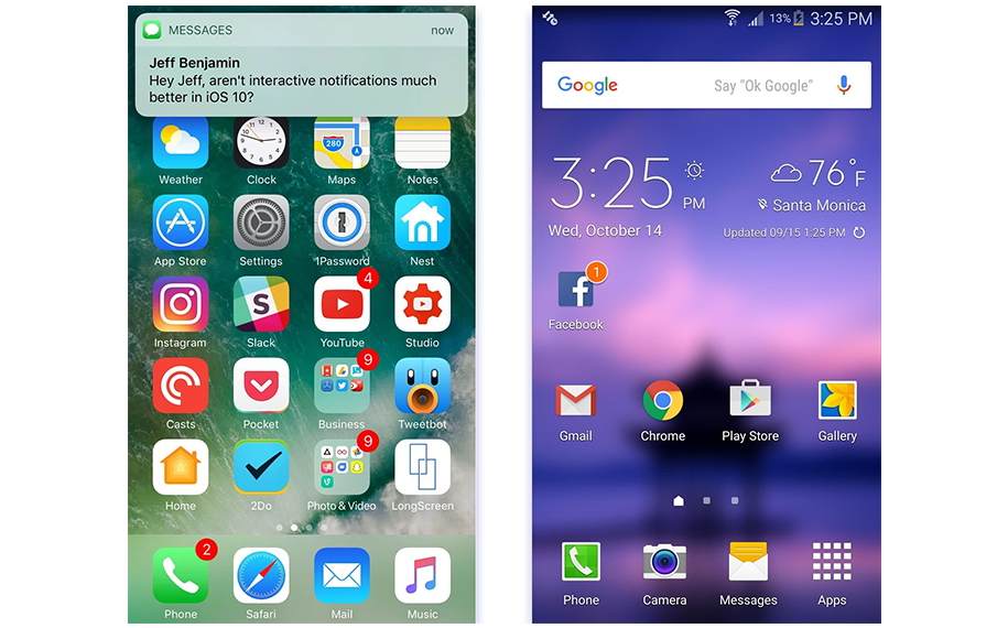
One of the outstanding features of great usability is that the notification is shown at the right moment. Nowadays, our smartphones are cluttered up with all sorts of messages, but unfortunately, not all of them were created keeping the users in mind.
Notifications based on location are good because a user gets them in the right places. If the program has properly collected the information about the user, it must know what he or she likes and dislikes, and as a result, it can send important notifications. For example, if we speak about e-commerce applications, one of the people’s favorite things is making a shopping list. It’s a source of information for admins of such programs since they can see what is important to a user and what is not.
Relevance based on location means sending a notification at the moment when the user can take a decision about buying something since the user is physically close to a store.
Notification about the last chance
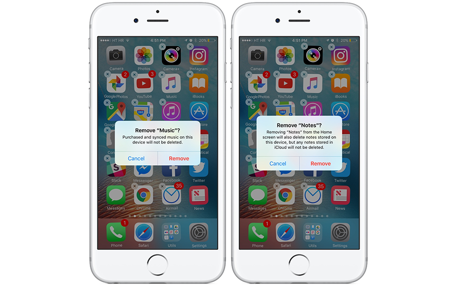
There’s nothing more dramatic than deleting an app by mistake. It frequently destroys all information and data that you’ve been gathering for a long time. Regardless of whether it’s a social networking app or cloud storage, losing data by unintended tapping or clicking is extremely painful.
If the program has correctly gathered information about its users, it must know their likes and dislikes.
That’s why notifications that require confirmation have to be clear about what is going to be deleted before deletion happens. These popups need to have the following features:
- be large enough to take the whole screen so that the users won’t skip them;
- ask short questions;
- use simple terms so that the users understand what action is in focus;
- use the heading in bold to attract the user’s attention;
- have distinct call-to-action buttons in vivid colors.
Numerical value
Typically, we better cope with tasks if we can calculate something since it allows us to analyze how much effort and time we have to put into it. Numbers also help to decide whether we want to do the task at the moment.
Notifications with numbers allow us to manage work processes more efficiently. Things that can be measured are helpful for usability because they allow arriving at more sensible decisions.
Once we see a window, notification, or just an icon that says we have a message, there’s a strong possibility that we’ll read it because “1” stands for the small amount of work.
At the same time, if we receive a notification about several messages, we are far more likely to put them off until we have enough time for them.
Google and Apple usually use numbers to tell us how many unread messages we have and how much work we will have to do if we make up our mind to read them. It gives users more control over their time.
Usability in the first place
It’s extremely easy for designers to get stuck in notifications. Every application seems to be cluttered with notifications and warnings.
The designer's primary goal is to decide what message has to be seen by a user. If a message influences a UX user, it has to be displayed, otherwise, there’s no point in showing the message. Be kind to your users and don’t annoy them for no reason with irritating notifications.